Details of Project
- Client: Database Concepts
- Industry: Software, financial
Highlights
- Case Studies
- Right side column form
- Contact Management System backend
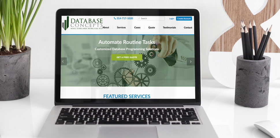
First, the home page sliders highlight the 3 main solutions. The company: Automates Routine Tasks, Organizes Critical Data, and Creates Meaningful Reports. Just below the sliders the site further explains the three main services with links to more detailed information. Below that area is a slider with client testimonials.
The inner pages are sprinkled with testimonials and the right column has quick links and a short form with a lime-green background. The background color brings the viewer's eyes toward the form which increases website conversion.
An added functionality to the site is the phone number at the top header on each page. This functionality is a standard on most of ePlus Marketing's Websites. We believe that site visitors should NOT have to hunt for a way to contact a company. The easiest way is to have to phone number at the top of the site. The phone number can also be seen throughout the text within the site.
 With over 20 years of experience, ePlus Marketing consistently utilize comprehensive analytical skills and creative resources to provide high value marketing exposure for their business partners. Their in depth knowledge of internet marketing, sales lead generation, e-commerce, brand strategy and SEO coupled with their positive attitude and win-win approach to business produce outstanding results for their clients.
ePlus Marketing agency can partner to best accomplish business growth goals. They consistently help clients increase revenue and profits while reducing costs. ePlus Marketing truly provides an outstanding internet platform that produces measurable results at a very fair price. They work for companies world-wide, and just not in St. Louis, MO.
  We could not have done this without all your time, dedication, work, professionalism, and overall support. To top it off, you've simply been fun to work with and are very generous and caring people. The end product is very good. Everyone who has seen
the site has been very, very excited.
 I have been with ePlus Marketing for a long time and one word that really stands out in my mind to describe this firm is "professionalism". They will bring you a complete project plan that is laid out step by step and the time and money that it will take to produce the project. But their efforts don't stop there..even after the project is completed, they will continuously work with you to bring new ideas to the table to produce even more results for your internet marketing. I believe that ePlus goes above and beyond and that is why I would never consider working with another firm. I can't recommend them highly enough. I know for a fact that I will be with ePlus Marketing for a very long time to come. I love this firm!